
A Guide To Great User Interface & User Experience Design
Note: This blog is the 2nd installment of a 3-part UI/UX design series. Click here to view the other posts.
User Interface and User Experience design (UI & UX design) for mobile apps is an art. It calls for deep knowledge, expertise, and a strong grasp of how the app in question will be used. A fantastic user interface design makes your mobile app functional and easy to use, ensuring that visitors have a positive experience. Therefore, it’s is critical to the success of any app.
UI & UX design elements that make a mobile app easy to use
Various UI elements will assist users in making it easy to navigate your app. They can be classified into four major groups:
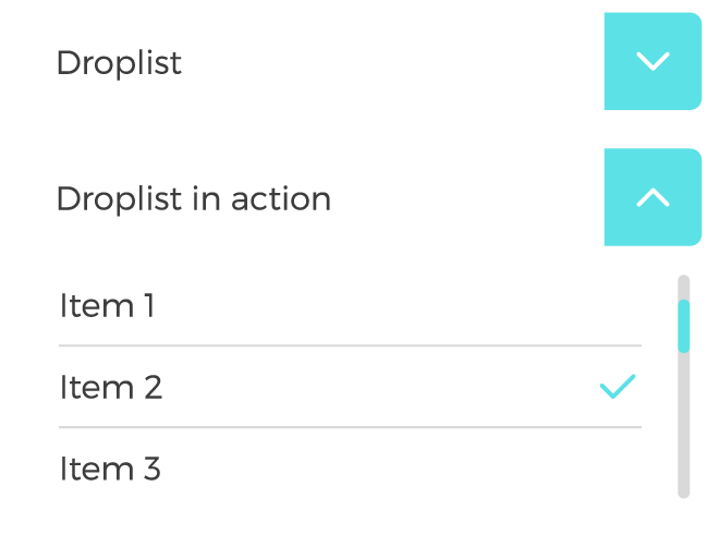
1. Input Controls
A UI input control is required whenever your app requests user input. Examples:
- Checkboxes
- Radio buttons
- Dropdown lists >>>
- Buttons
- Text fields
2. Navigational Components
Navigational components assist visitors in navigating and locating information about the features and functionality of your mobile app. Examples:
- Sliders
- Menus
- Search fields >>>
- Tags
- Icons

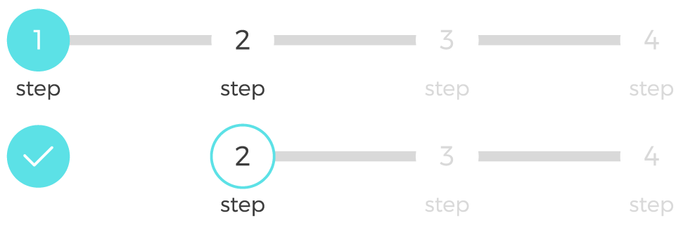
3. Informational Components
Informational components within your UI/UX provide users with important context and serve to reinforce the value/utility of your mobile app. They are also helpful for sharing information with users and keeping them engaged. Examples:
- Progress bar >>>
- Notifications
- Message boxes
- Modal windows
4. Containers
UI containers are used to organize data. They can help you conserve space without sacrificing information and serve to streamline the user experience of your mobile app. Examples:
- Accordions
- Carousels
- Tabs >>>

How to design a UI & UX that works for everyone
The UI & UX designers’ primary goal is to develop easy-to-use apps. “User-friendly” refers to being friendly to all users. The term “inclusive design” refers to distinct experiences that cater to different people’s needs rather than a single design for all.
Several timeless UI & UX design techniques might assist you in implementing an inclusive design. In this case, we would like to share Microsoft’s inclusive design principles.
Recognize exclusion
Exclusion occurs when we forget that everyone is different and create an UI/UX that only appeals to a specific subset of potential users. As a result, the first step toward inclusive design is to identify distinct user groups within your target audience.
Learn from diversity
Social variety is an excellent source of design ideas and usability insights. For example, solutions designed for persons with disabilities may lead to new, simpler, and more pleasurable experiences for everyone outside this specific user group.
Solve for one, extend to many
The preceding two concepts help develop inclusive and enjoyable mobile app experiences for all potential users. An essential requirement for one person may become a better product experience for another.
Other relevant inclusion points that should be addressed for any mobile app are the following.
Use inclusive imagery
Representing humans with symbols, graphics, and photos requires thoughtfulness. These visuals can be produced by abstracting or diversifying.
- Abstraction – Replaces a realistic, detailed depiction with something that allows consumers to relate to the visual. Objects or animals can be used as conceptual yet human-like depictions.
- Diversifying – The diversifying method tries to portray user differences. It is excellent for promoting in-product images that do not directly reflect users or people.
Write inclusive copy
Making words work for everyone is the goal of inclusive copywriting. To create your text more inclusive, use simple language, pay attention to the phrases you use in forms, and write notifications intelligently and consistently.
The importance of consistency and branding in UI & UX design
Design consistency connects UI/UX design components with distinct and predictable behaviors, essential for a strong product experience. Consistency should be applied in the following main areas:
UI patterns
When it comes to known UI patterns, don’t reinvent the wheel. Recurring patterns help to tackle typical UI/UX design issues.
As mobile apps are now a ubiquitous part of our society and daily lives, users have come to expect certain UI design patterns. For instance, most users expect look to the upper left-hand corner of an app’s UI to access the app’s menu and settings. Following simple patterns such as this in UI/UX design makes your app easier to use by providing important features/functionality where people expect to find it.
Design hierarchy
Along with design patterns, a defined design hierarchy improves UI consistency. Users naturally pay attention to the order and importance of the items they interact with. When it comes to visuals and the human eye, some components (larger sizes, brilliant colors, etc.) take precedence over others, depending on how “noticeable” they are.
Branding elements
Maintain brand consistency throughout the entire mobile app. Typography, logo, suitable image styles, brand color schemes, and other brand features should all be reflected in the application.
Actions
Consistent actions eliminate the need for user discovery/uncertainty, allowing their workflow to go smoothly. Suppose users understand how to utilize functionality in one part. In that case, they will understand how to use it in all sections, as long as it is consistent.
Copy and content
It is not just about the aesthetic aspects but also the text throughout the app. Use consistent text — particularly consistent vocabulary — across the app. Consistent copy eliminates this ambiguity.
How to find the balance between being unique and being recognizable in UI & UX design
While many user interactions and visual designs communicate to various individuals in different ways, certain graphics are universally recognized across a wide variety of cultures and groups.
Like the design patterns discussed above, integrating recognizable symbols and iconography in the UI/UX design of your app eliminates ambiguity and the need for extra effort on the part of the end user. We must assure recognition and usefulness. Two good examples:
- Shopping cart – Having a recognized shopping cart icon is not only an excellent idea; it has become a user expectation.
- Search field – Searchers want one thing: a search field where they can type in exactly what they’re looking for.
The importance of usability in UI & UX design
Usability measures how effectively and efficiently a given user in a specific setting is able to use a mobile app to achieve an objective. This component of mobile app UI/UX design should comprise the following elements:
- Effectiveness – It supports users in completing actions.
- Efficiency – Users can perform tasks quickly through the most uncomplicated process.
- Engagement – Users find it pleasant to use and appropriate for its industry.
- Error tolerance – supports a range of user actions and only shows an error in real erroneous situations.
- Ease of learning – New users can accomplish goals easily and even more efficiently on future visits.
There you have it! We hope you found this crash course on UI/UX design for mobile apps useful. If you’re interested in learning more about this topic or about mobile apps in general, check out related content on our Mobile App Strategy topic page.
As a leading provider of white-label mobile apps, Smith Micro works with each wireless carrier client to design and deploy enjoyable mobile user experiences aligned with their unique brand and product strategy. Contact us today to learn more about our carrier-grade solutions.